Reliant Medical Group
In my experience working with many different clients, I am often tasked with redesigning only a portion of a client’s site that isn’t working for them. This means my new designs have to match to the styles on other pages that are not being updated, while still performing up to the standards that a client has of a newly designed landing page focused on driving sales. Reliant Medical Group was one such project. They came to us with requests for an updated menu, footer, homepage, and landing page design, but understandably did not want to go through the long process of re-styling their entire website.
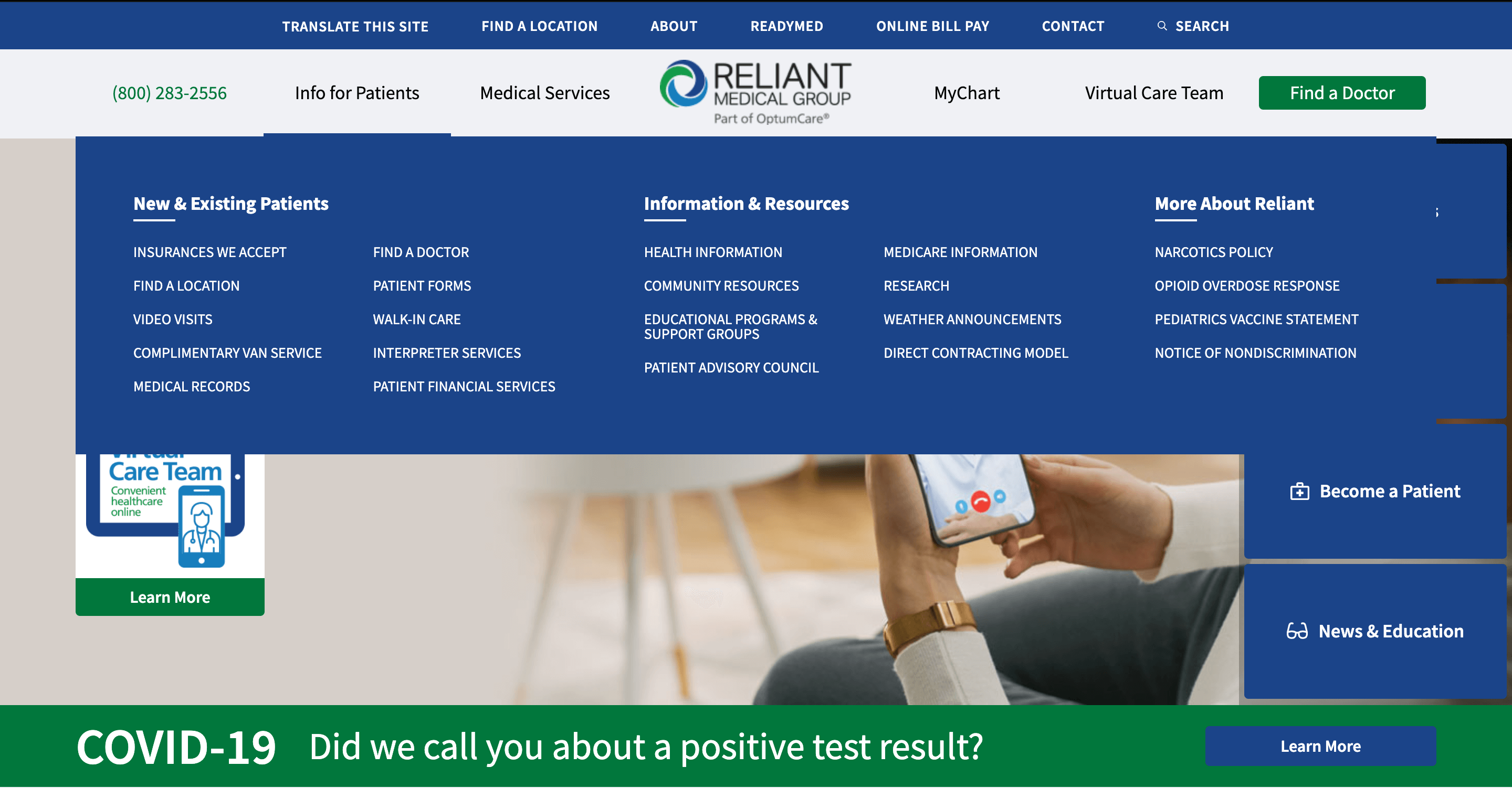
I began the site refresh with the new menu and footer designs. The client wanted to have several different options to choose from, so I created 3 designs: One very similar to their previous design with mild usability updates, one taking the design in a completely new direction, and one that was a marriage of the two. They ultimately chose the “in-between” option as they wanted something similar to their old site so frequent users wouldn’t be too confused by the change, but still wanted a bit more of a change than the simplest design gave them. The menu refresh reordered the links, simplified the menu and dropdown styling, better organized the sitemap, and categorized the submenus to help the user find what they need efficiently.
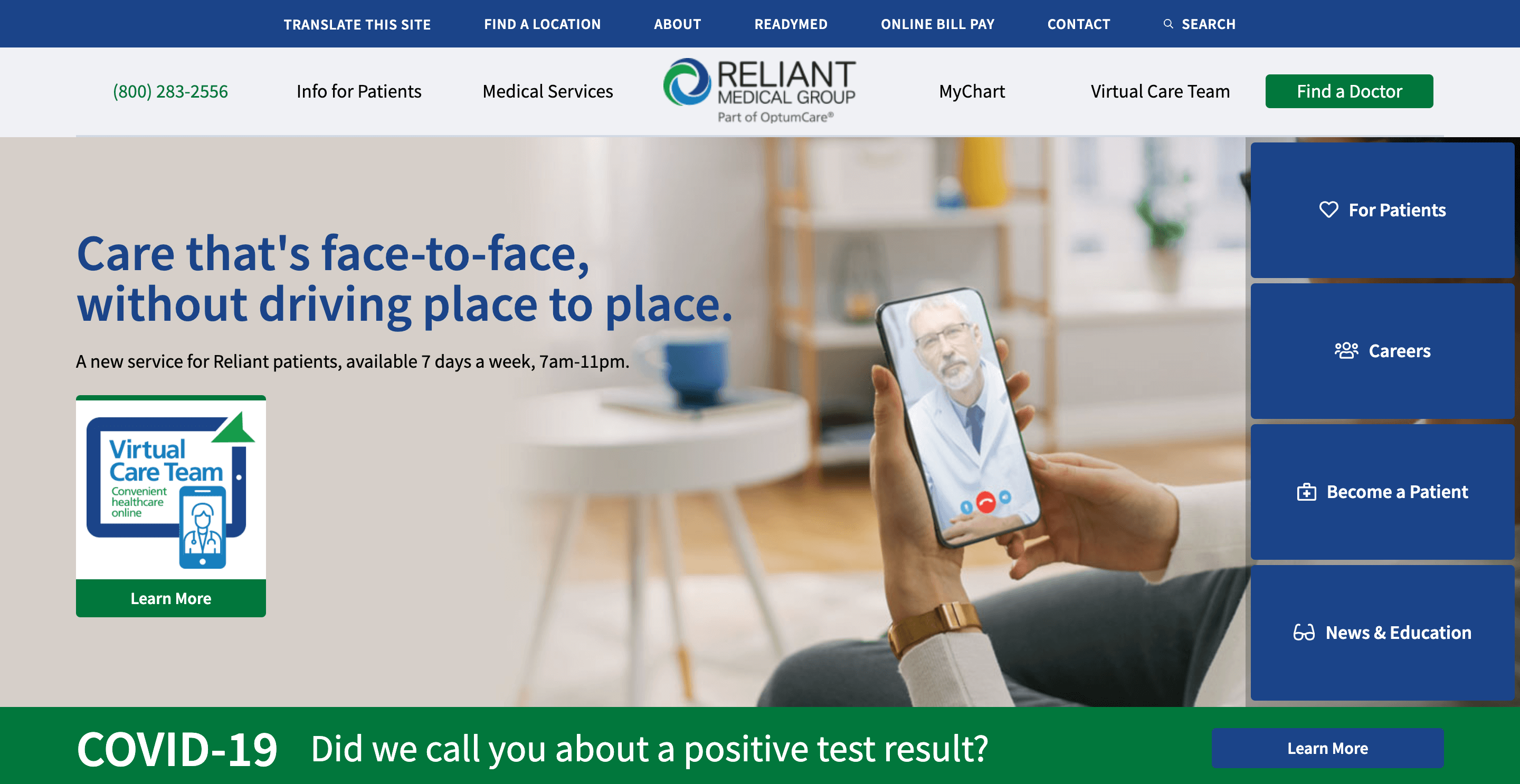
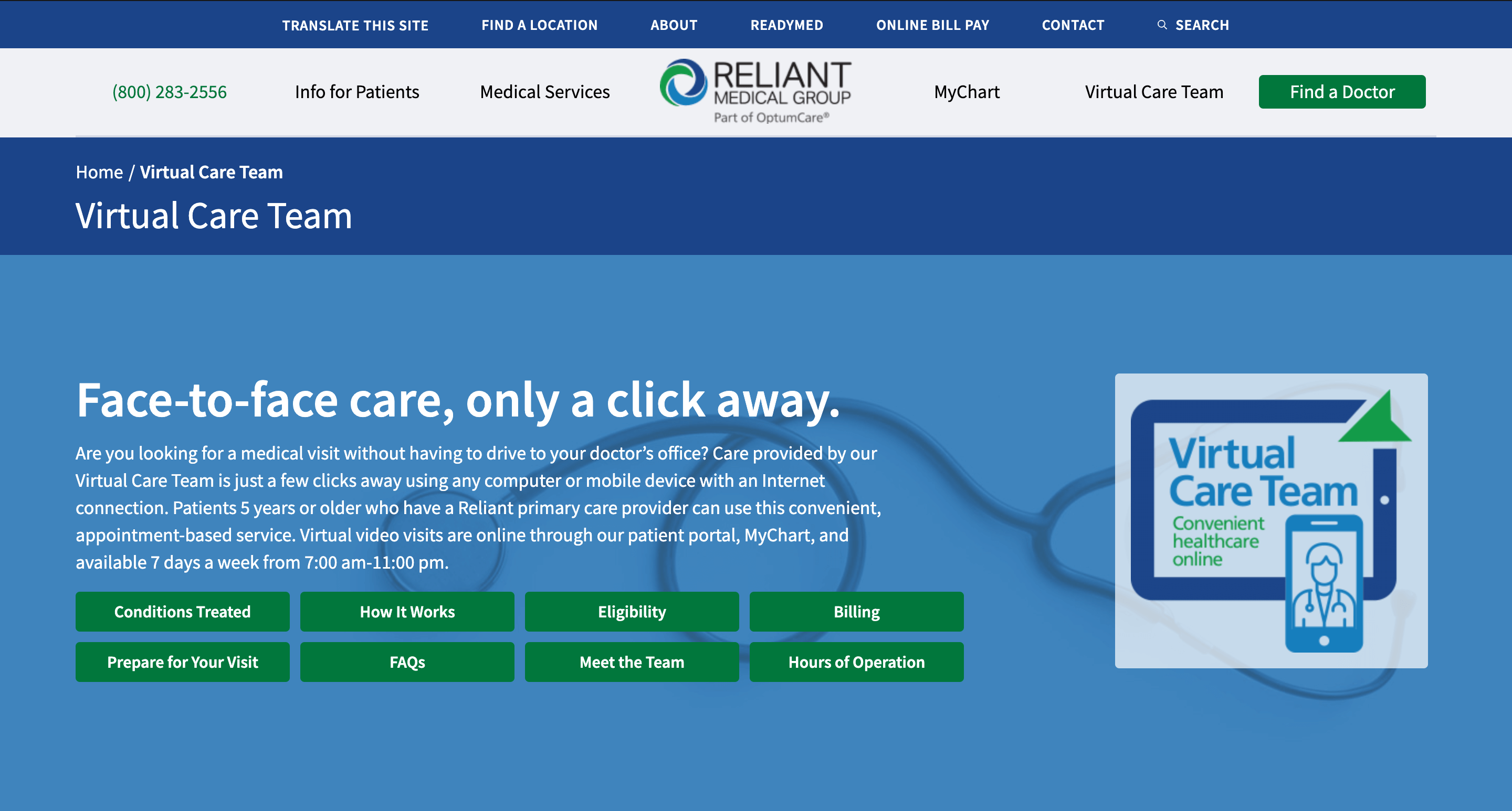
Once the menu and footer design were finalized I moved onto the homepage. By this point the client and I had worked together to build up a solid understanding of their users’ needs. With this foundation I was able to effectively develop a homepage that fulfilled all their criteria and emphasized the most important aspects of their business in ways that were professional and user friendly. This updated design blended well with old pages that would not be getting reworked, and I then used the design language I had developed to create the landing page for the Virtual Care Team